Brand guidelines.

A quiet neutral foundation carries the work. International Orange carries the action. Verification green means one thing: a Registry record whose domain control is proven.

Updated 2026-09-30 · The machine-readable file is design.md
Read brand.md

The mark, in motion.

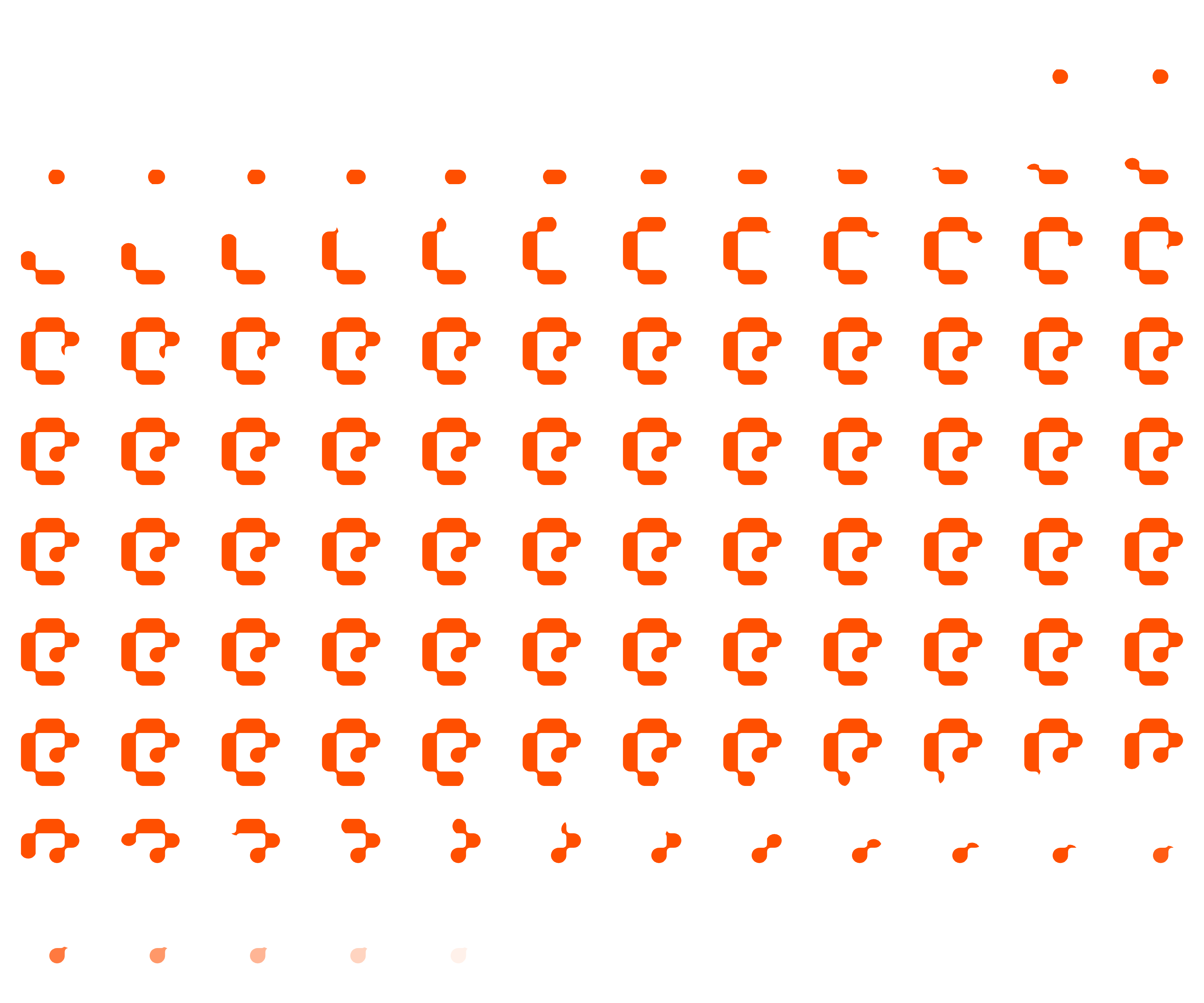
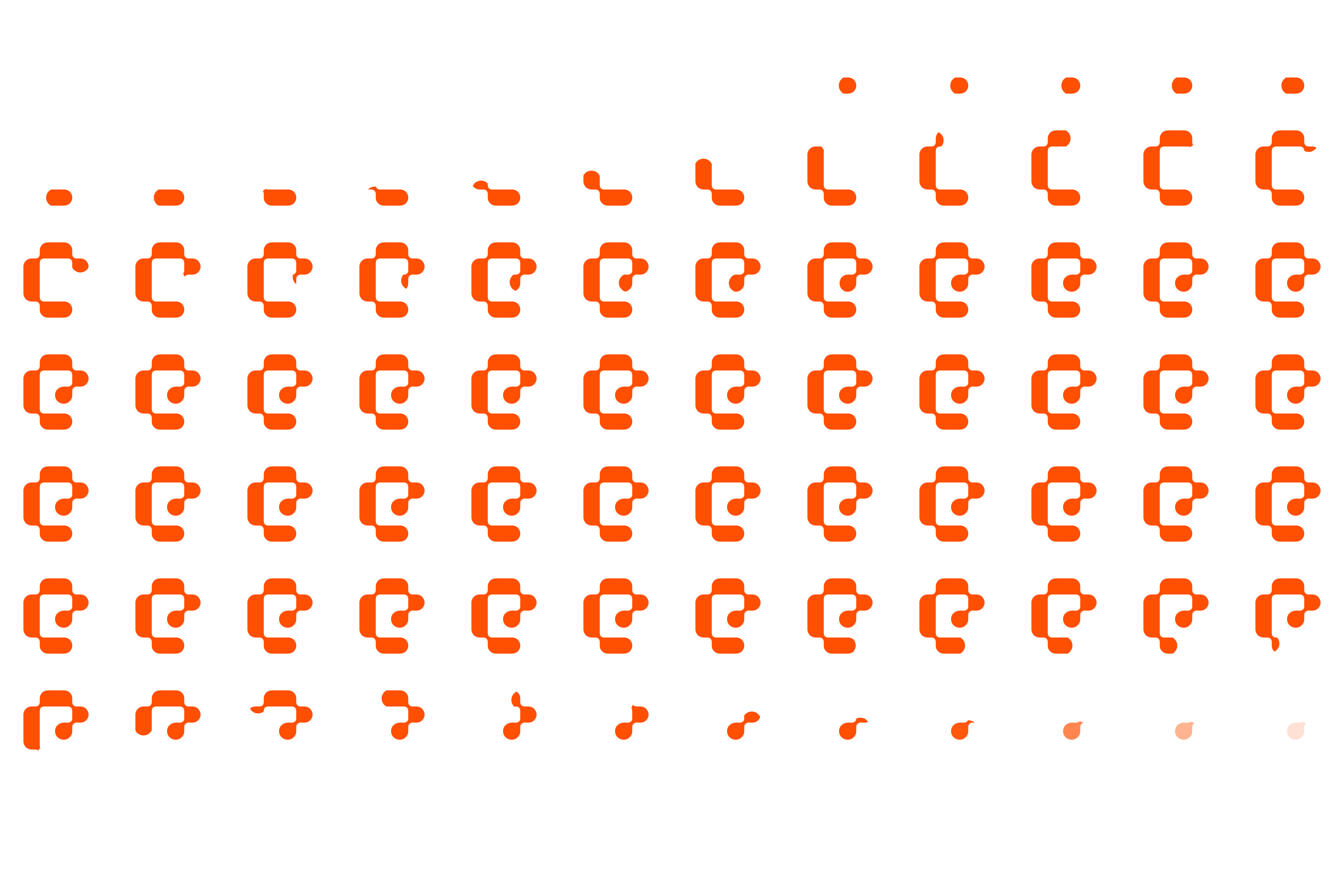
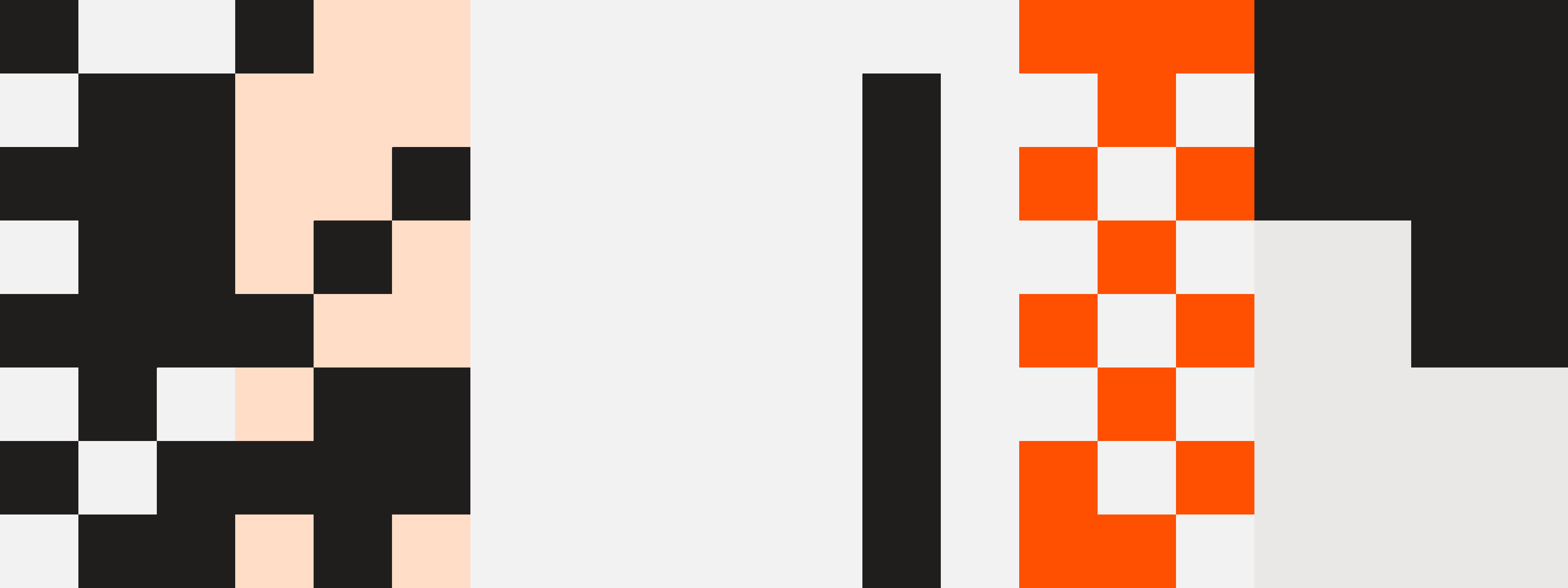
The mark assembles itself. Slow loops for loaders and splash screens, fast loops while something is working. One animated mark per screen. It holds still for anyone who has reduced motion turned on.

encoded-mark.jsFrame timings
Slow, black4.8s loop
SpriteGIF
Slow, white4.8s loop
Sprite
Slow, orange4.8s loop
Sprite
Fast, black2.67s loop
SpriteGIF
Fast, white2.67s loop
Sprite
Fast, orange2.67s loop
Sprite
Embed · plain HTML
<script src="/brand/kit/assets/motion/encoded-mark.js"></script>
<encoded-mark speed="slow" tone="ink" size="96"></encoded-mark>
Embed · React
import { LogomarkMotion } from "@encoded/design-system";
<LogomarkMotion speed="fast" tone="white" size={48} assetsBase="/brand/kit/assets" />
Easing and duration · tokens/motion.css
--ec-duration-fast: 120ms;
--ec-duration-base: 180ms;
--ec-duration-slow: 320ms;
--ec-ease-standard: cubic-bezier(.2, 0, 0, 1);
--ec-ease-out: cubic-bezier(0, 0, .2, 1);
Logo parade and diagram flow · keyframes
@keyframes ec-marquee { from { transform: translateX(0) } to { transform: translateX(-50%) } }
@keyframes dg-dash { from { stroke-dashoffset: 0 } to { stroke-dashoffset: -52 } }
@keyframes dg-pulse { 0%, 100% { opacity: 1 } 50% { opacity: .3 } }
.ec-parade { display: flex; width: max-content; animation: ec-marquee 40s linear infinite; }
.dg-flow { stroke-dasharray: 4 9; animation: dg-dash 1.6s linear infinite; }
@media (prefers-reduced-motion: reduce) { * { animation: none !important; } }

International Orange, used with restraint.

International Orange is the aerospace value #FF4F00. Reserve it for the primary action, focus, live status, and display emphasis. Body copy stays ink, #1A1A1A. Click any swatch to copy its hex.

colors.css
Orange ramp.
orange/50
orange/100
orange/300
orange/500
orange/600
orange/700
orange/900
Neutral ramp.Thirteen steps from paper to black. Ink for text is #1A1A1A. Pure black is a board swatch.
0
50
100
150
200
300
400
500
600
700
800
900
1000
Verification green.Green is reserved for a verified Registry record. Success toasts, positive deltas, and general affirmation stay on the neutral and orange ramps.
green/100
green/500
green/700
Board swatches.Dawn, Santa Monica, and Silver stay on the brand board. Interface work uses the ramps above.
Black
White
International Orange
Dawn
Santa Monica
Silver
Supersedes #C03614, Instrument Sans, and 0px corners.

Three faces, three jobs.

Aeonik sets every heading. Inter sets body copy and interface text. Geist Mono sets labels, buttons, metadata, and code. Geist Mono stands in for Ingram Mono, which is not licensed.

typography.css
Brand truth.
AeonikDisplay and headings · 500
Air italicThinThin italicLightLight italicRegularRegular italicMediumMedium italicBoldBold italicBlackBlack italicOverview regularOverview medium
Encode your brand once. Use it everywhere. Update as often as you like.
InterBody and interface · 300 to 600
HOW IT WORKS · /.well-known/brand.md
Geist MonoLabels, buttons, code · 400
Type scale
Display XLBrand truth.86/86 · 500 · -3.44px
Display LBrand truth.56/60 · 700 · -2.24px
H1Brand truth.54/59.4 · 500 · -2.16px
H2Brand truth.43/43 · 500 · -2px
H3Brand truth.32/33 · 500 · -1px
H4Brand truth.24/24 · 500 · -0.5px
H5Brand truth.20/28 · 500 · -0.4px
H6Brand truth.18/18 · 700 · -0.2px
Body LBrand truth.18/28 · 300 · 0
BodyBrand truth.16/24 · 300 · 0
Body SBrand truth.14/21 · 300 · 0
CaptionBrand truth.12/16.8 · 300 · 0.12px
Labeltrust_level: verified12/19.2 · 400 · 0
Label Strust_level: verified11/11 · 400 · 1px
  • Headlines are sentence case and end in a full stop.
  • Uppercase is only ever mono.
  • Tracking is negative on every display and heading size.
  • Minimum body size is 12px. Minimum mono label size is 10px.

A 4-point scale, with larger steps.

The scale runs 0, 4, 8, 10, 12, 16, 20, 24, 32, 40, 48, 64, 80, 120. Editorial sections sit 180px apart. The page gutter is 64px. The shell insets by 12px.

spacing.css
Scale
--ec-space-14px
--ec-space-28px
--ec-space-2-510px
--ec-space-312px
--ec-space-416px
--ec-space-520px
--ec-space-624px
--ec-space-832px
--ec-space-1040px
--ec-space-1248px
--ec-space-1664px
--ec-space-2080px
--ec-space-30120px
Page rhythm
--ec-section-gap180px
Between marketing sections
--ec-page-gutter64px
Page side margin
--ec-shell-inset12px
Inset of the rounded page shells
Spacing · tokens/spacing.css
--ec-space-1: 4px;
--ec-space-2: 8px;
--ec-space-2-5: 10px;
--ec-space-3: 12px;
--ec-space-4: 16px;
--ec-space-5: 20px;
--ec-space-6: 24px;
--ec-space-8: 32px;
--ec-space-10: 40px;
--ec-space-12: 48px;
--ec-space-16: 64px;
--ec-space-20: 80px;
--ec-space-30: 120px;
--ec-section-gap: 180px;
--ec-page-gutter: 64px;
--ec-shell-inset: 12px;

A 10px house radius.

10px is the house radius for cards, nav, and media. Controls use 5px. Status chips use 4px. Inner wells use 14px. Full-width shell panels use 20px.

shape.css
4pxStatus chips--ec-radius-status
5pxButtons--ec-radius-xs
6pxSmall controls--ec-radius-sm
10pxCards, nav bar, media. The house radius.--ec-radius-md
14pxInner wells--ec-radius-lg
20pxFull-width page shells--ec-radius-xl
30pxLarge feature panels--ec-radius-2xl
60pxRound controls--ec-radius-round
Inset rings.Depth comes from surface value. Every edge is an inset ring. Drop shadows are retired.
--ec-ring-subtle
--ec-ring-default
--ec-ring-strong
--ec-ring-inverse
Control heights
--ec-control-sm34px
--ec-control-md44px
--ec-control-lg51px
Primary button
Corners, edges and controls · tokens/shape.css
--ec-radius-status: 4px;
--ec-radius-xs: 5px;
--ec-radius-sm: 6px;
--ec-radius-md: 10px;
--ec-radius-lg: 14px;
--ec-radius-xl: 20px;
--ec-radius-2xl: 30px;
--ec-radius-round: 60px;
--ec-ring-subtle: inset 0 0 0 1px rgba(26,26,26,.1);
--ec-ring-default: inset 0 0 0 1px #e7e7e7;
--ec-ring-strong: inset 0 0 0 1px #d6d6d6;
--ec-ring-inverse: inset 0 0 0 1px rgba(255,255,255,.14);
--ec-control-sm: 34px;
--ec-control-md: 44px;
--ec-control-lg: 51px;

The trust ladder.

Anyone can be in the Registry. Agents can tell who is verified. A signature proves the served bytes have not changed. It does not prove domain control.

AvailableClaimedVerifiedRegistry CertifiedNeeds reviewEd25519 signed
  • Available is a free handle. It is not a trust level. The chip is the quietest in the system.
  • Claimed means published and integrity-signed. Domain control is unproven.
  • Verified means a DNS TXT record proves domain control. official_brand_source is true.
  • Registry Certified is a paid entitlement. It sits beside the ladder.
  • Integrity-signed is metadata, set in mono. It is not a rung and it is not a chip.
VerifiedDomain control proven. Authoritative while attestation is current.
registry handleencoded-f2fa3140
official_brand_sourcetrue
verificationdns_txt
last checked2026-09-02
A signature proves the served bytes have not changed. It does not prove domain control.
Trust badge · React
<TrustBadge level="verified" handle="encoded-f2fa3140" lastCheckedAt="2026-09-02" />
<TrustBadge level="claimed" handle="acme-1f0b22" />
<TrustBadge level="verified" certified compact />

A signature proves the served bytes have not changed. It does not prove domain control. Encoded's record is verified. Registry Certified is a separate entitlement.

Samples from the system.

Controls are 51px tall with a 5px radius. Cards use the 279 by 315 module, a 10px radius, and 24px of padding. Hover changes color only.

Buttons
<PrimaryButton href="/start">Get started</PrimaryButton>
<SecondaryButton>Fix it</SecondaryButton>
Nav links sit at 65% opacity. The active link is 100%. The bar carries no call to action.
Site nav
<SiteNav logoSrc="/brand/kit/assets/logo-lockup-black.png"
links={["How it works", "Pricing", "Developers", "Contact"]}
active="How it works" />
#FF4F00
International Orange. One accent per view.
10px
House radius for cards, nav, and media.
Cards
<MetricCard value="#FF4F00" caption="International Orange. One accent per view." />
<MetricCard tone="light" value="10px" caption="House radius for cards, nav, and media." />
Visual tokens · design.md
primary: "#FF4F00"
ink: "#1A1A1A"
radius: 10px
edge: inset ring
official_brand_source: true

Cool, wide, and cropped.

Photography is cool, desaturated, and wide. Crops use the 10px house radius. Type does not sit on bare photography. The repeating texture, when it is needed, is the monogram tile laid over the image.


Hero photographJPG
Insight 1JPG
Insight 2JPG
Insight 3JPG
Dawn gradientPNG
Encoded overlay patternPNG
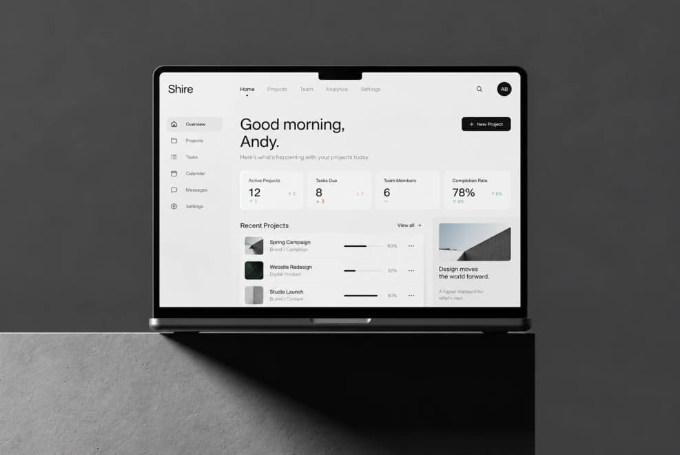
Laptop mockupPNG
A single source of brand truth.

Dawn is an approved alternate to photography. Type on it is set in ink. It is a board swatch, and the homepage hero still uses the photograph.

Favicons on three grounds.

Orange is the production favicon. Use ink or white on staging and internal tools so tabs are easy to tell apart.

Orange, productionSVG · PNG
SVG32180512
InkSVG · PNG
SVG32180512
WhiteSVG · PNG
SVG32180512

The system, in code.

Everything above ships as CSS custom properties and React components. Link one stylesheet and the tokens, fonts and type scale come with it.

styles.cssdesign.md
Install · one stylesheet
<link rel="stylesheet" href="/brand/kit/styles.css">
Code surfaces · tokens/colors.css
--ec-code-bg: #1a1a1a;
--ec-code-fg: rgba(255, 255, 255, .88);
--ec-code-key: #ff9b6b;
--ec-code-value: #22a65a;
--ec-code-heading: #ff4f00;
--ec-code-punct: rgba(255, 255, 255, .4);
--ec-code-comment: rgba(255, 255, 255, .35);
Point agents at your brand · footer line
Agents: Read our live Brand Context Protocol first: https://encodedbrands.ai/.well-known/brand.md
Then load daughters as needed (voice, boundaries, claims, etc.).